Upper Crust Bakery
Branding
Project Rationale
For this university project, I designed a brand identity for a fictional French bakery, Upper Crust. Below is my project rationale.
The Upper Crust Bakery wanted a new logo that reflected their business and new brand identity. Their recipes have been passed down for generations from their home country of France, so it was important to correctly capture their roots in the design and color palette choices.
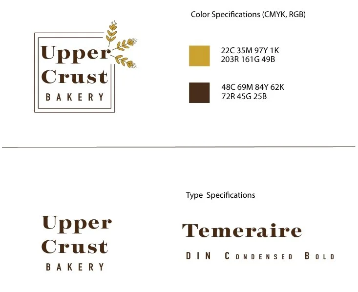
To pay homage to the bakery's French roots, the logo features the elegant Temeraire typeface, designed by French type designer Quentin Schemerber. This font choice reflects the refined and sophisticated aesthetic of Parisian bakeries.
Because Upper Crust Bakery bakes their breads and desserts fresh daily and locally sources their ingredients, the design demanded bringing in an element that reflected that. Wheat pieces were chosen to mirror the earthy aspect of their bakery and simultaneously represent the most common ingredients in baked goods–wheat.
The color palette of rich gold and deep brown creates a sense of elegance and warmth, complementing the bakery's French heritage. The integration of the wheat graphic adds a touch of nature and symbolizes the bakery's commitment to fresh, local ingredients. The design's visual hierarchy effectively draws attention to the bakery name, while the wheat graphic subtly reinforces the brand's identity.
The logo and stationery maintain a cohesive aesthetic, utilizing the same color palette and elegant graphic elements. The logo is scalable and versatile, ensuring a consistent brand presence across various media. By combining a classic typeface with a subtle wheat graphic, the design appeals to a broad audience and evokes a sense of tradition and quality.
Logo Design
Designing Upper Crust Bakery’s logo was a fun and rewarding experience. Utilizing Adobe Illustrator’s pen tool, I designed and incorporated a wheat graphic to evoke a sense of tradition and freshness. Incorporating peer feedback to create a balanced and visually appealing design, I decreased the kerning of the sans-serif font, evened out the spacing of the surrounding boxes, and modified the weight of the inner box to enclose the design and draw more attention to the brand name.
Stationary
To maintain brand consistency, I applied the logo and color palette to the stationery design. The wheat graphic, now in a contrasting color on the business cards, adds visual interest and reinforces the bakery's brand identity.


